How I work

Two lenses: the screen and the system

I move between two scales of design. Up close, a UX/UI process built around cognitive load, separating what a user must do from what they might reference. Pulled back, a research-led service design process that maps the whole ecosystem of people and systems behind a single action.

Disciplines
UX/UI · Service Design
Methods
Research · Blueprinting
Focus
Interaction · IA · Systems
Devices
Desktop + Mobile
Process 01 · UX / UI

the interface process

How I take a single, dense screen and make the right thing obvious, from audit to shipped configuration.

01 Discover

Audit the interface & the friction

I start by mapping what users actually need against what the interface puts in front of them, and finding where the gap lives.

Audit the existing record page, field by field, for relevance and redundancy.
Locate the friction, buried data, “toggle tax,” field fatigue, endless scroll.
Understand the persona: what decision are they here to make?
02 Define

Separate action from reference

I translate findings into a clear priority: immediate action first, historical detail second, deep-dive data one click away.

Decide what earns a place at the top of the page, and what doesn’t.
Curate a small set of “power fields” and the critical actions around them.
Frame the goal as a question: “what do I need to do next?”
03 Architect

Shape the information architecture

I structure the page around how the eye actually moves and how attention is best spent.

Place critical data inside the F-pattern reading zone.
Use progressive disclosure, tabs and sections, to hide low-frequency detail.
Choose the right template (e.g. Header & Right Sidebar) for the workflow.
04 Build

Configure it for real: clicks, not code

Design isn’t just visuals; it’s configuration. I build the solution natively in the platform so it ships.

Assemble pages in the Salesforce Lightning App Builder.
Use Dynamic Forms and a Dynamic Highlights Panel for modular, high-performance layouts.
Keep it maintainable, declarative configuration over custom code.
05 Validate

Pressure-test & prune

I confirm the design holds up across devices and genuinely lowers the effort of the task.

Check desktop ↔ mobile parity, one single source of truth.
Remove obsolete or redundant fields uncovered in the audit.
Measure the win: less toggling, lower time-to-task, cleaner CRM.
Process 02 · Service Design

research-led service design

When the problem is bigger than one screen, I zoom out. This is how I research the people in a system, map how a single action ripples across them, and design the invisible chain that makes the experience work, from the Deliveroo blueprint to the remittance research behind Moyo.Exchange.

01 Research & immersion

Start with evidence, not assumptions

Every service starts with research. I combine qualitative insight with hard secondary data to understand every actor in the system before drawing a single screen.

Identify and interview the stakeholders, customers, riders, restaurants, internal teams.
Synthesise pain points and motivations across the whole journey, not just one touchpoint.
Ground decisions in data, e.g. World Bank remittance costs that framed Moyo.Exchange.
02 Map the ecosystem

Blueprint the multi-stakeholder lifecycle

I visualise how one simple action triggers a complex chain of backstage events across people and systems.

Build a service blueprint spanning the end-to-end, multi-stakeholder lifecycle.
Capture front-stage actions, back-stage logistics and the support processes beneath them.
Identify operational blockers and where knowledge needs to flow between teams.
Service Blueprint · Deliveroo · Front Stage → Line of Visibility → Back Stage
End-to-end Deliveroo service blueprint mapping customer, app, rider and restaurant actions across the line of visibility
A real example, my Deliveroo service blueprint. Click to view it full-screen.
03 Draw the line of visibility

Separate what’s seen from what powers it

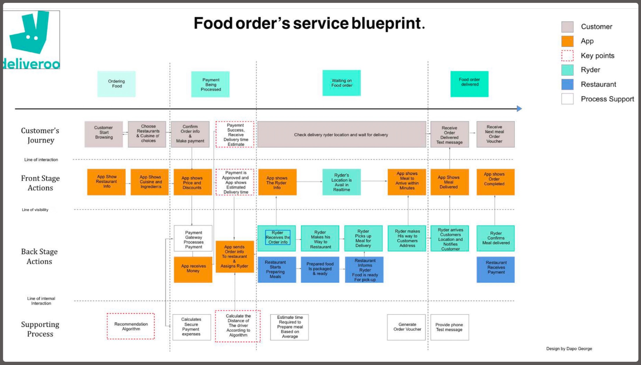
The hinge of any service: what the user sees, versus the human and third-party work that makes it happen.

Split automated app responses (front stage) from human actions and logistics (back stage).
Pinpoint where the app must “bridge”, e.g. a rider’s GPS becoming an “arriving in minutes” notice.
Surface the invisible infrastructure: payment gateways, recommendation and distance algorithms.
04 Orchestrate touchpoints

Synchronise automation and human action

I design the moments where automated systems and human actions must stay in lock-step.

Align triggers, one payment success can assign a rider and alert the kitchen at once.
Design the hand-offs between actors so nothing drops between stages.
Translate back-stage events into clear, timely front-stage feedback for the user.
05 Measure service impact

Quantify the friction, then design it out

A blueprint earns its keep when it reveals friction you can measure, and remove.

Locate quantified friction points, like a 15% gap in the rider-to-kitchen hand-off.
Improve knowledge flow across teams and dissolve operational blockers.
Validate that the redesigned service lowers effort across the whole journey.
· Tools & methods

What I build with

User Research Stakeholder Mapping Service Blueprinting Journey Mapping Salesforce Lightning SLDS Lightning App Builder Dynamic Forms Figma Datawrapper Prototyping Information Architecture Responsive Design
· Principles

What every screen has to earn

A

Cognitive load reduction

Fewer decisions per screen. Surface the relevant, defer the rest.

B

Action-first IA

“What do I do next?” leads “what are the details?”

C

Progressive disclosure

Low-frequency data stays one click away, never in the way.

D

Mobile parity

One responsive system, the same truth on every device.

E

Whole-system thinking

Design the back-stage chain, not just the screen the user touches.

F

Evidence over assumption

Research and data set the brief before a pixel is drawn.