Redesigning the standard Salesforce Account record page to cut “toggle tax” and put action-first data in front of both desktop and mobile users.
Standard CRM interfaces suffer from information overload, the data that matters most is hidden behind deep scrolls and stacked tabs, so account managers pay a constant “toggle tax” just to answer a simple question.
My goal was to architect a persona-based record page that prioritizes immediate action (Activities) while keeping historical data (Related Lists) and deep-dive details organized and one glance away, not buried.
Every field competes for attention; nothing is prioritized for the task at hand.
Answering “what’s next?” means hopping between tabs and losing context each time.
The next best action sits below historical detail instead of leading the page.
In account management, “what do I need to do next?” matters more than “what are the account details?”, so lead with action.
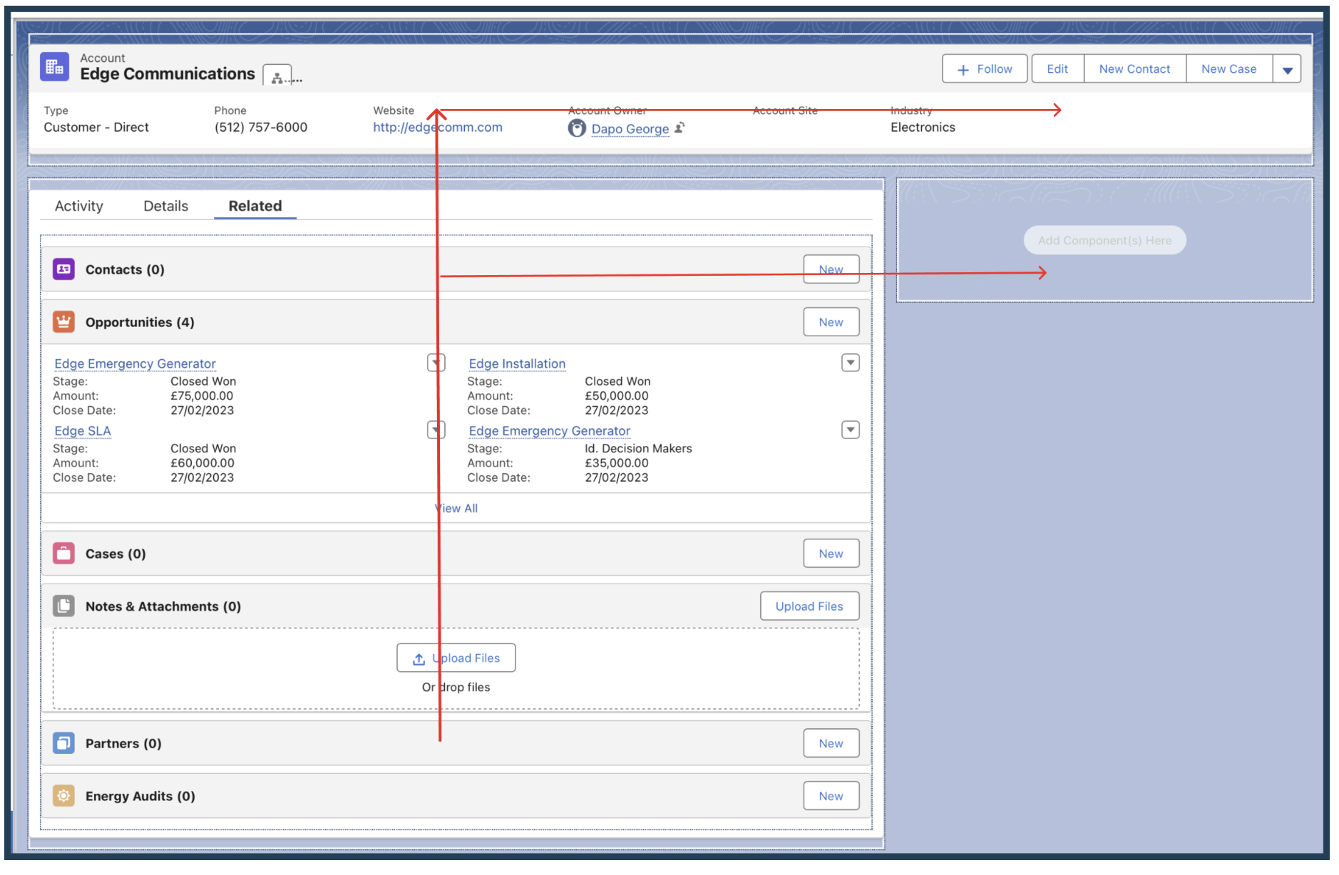
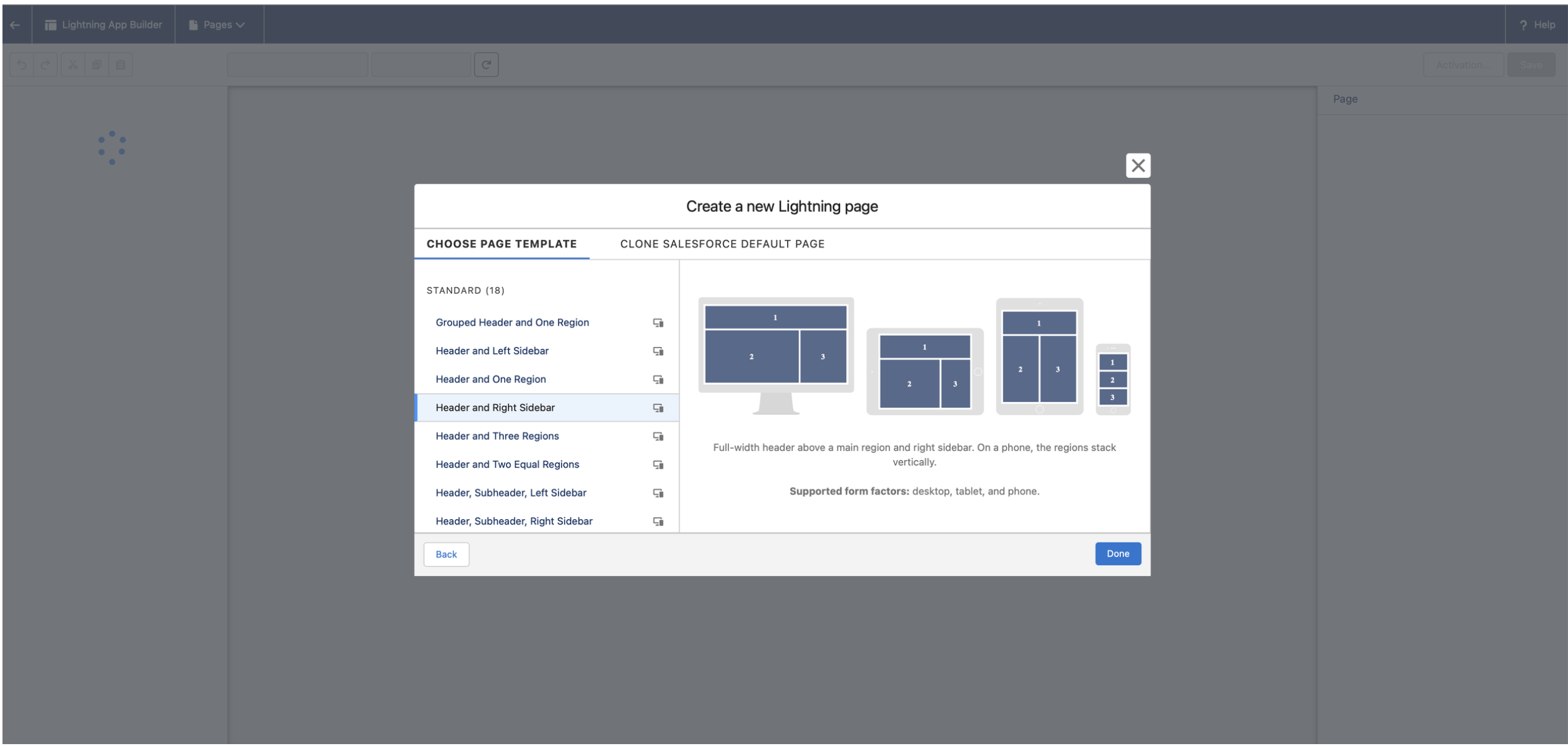
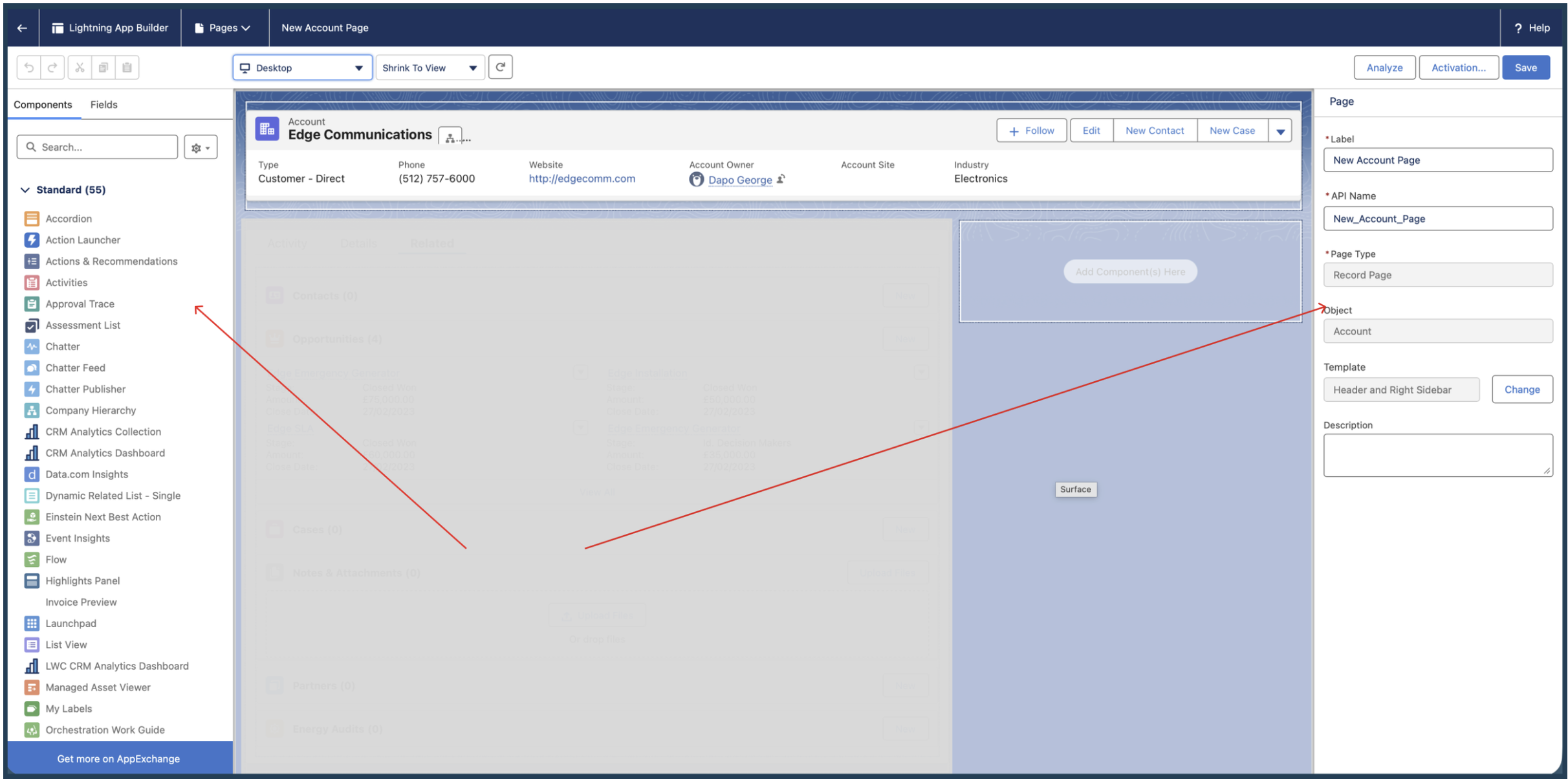
Using the Salesforce Lightning App Builder, I rebuilt the page on a Header & Right Sidebar template, keeping the most critical real-time information inside the F-pattern reading zone, where the eye lands first.
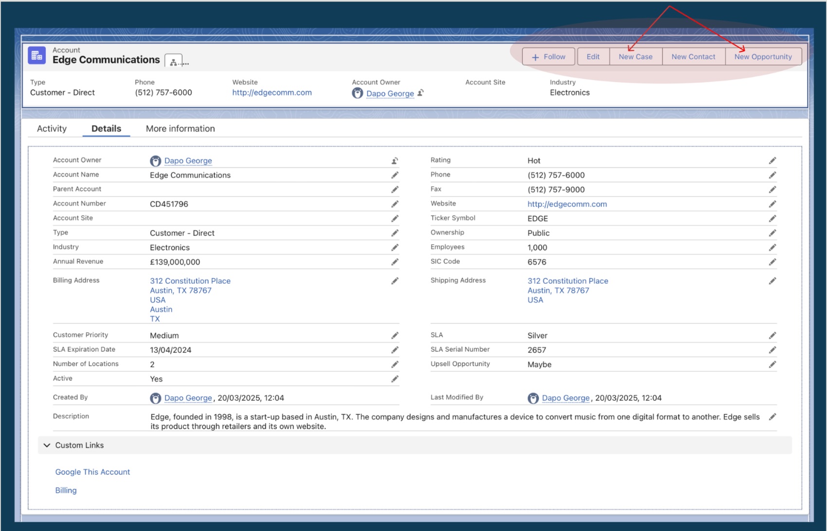
A top-level panel gives an instant 360° view of the account, without clicking a single tab.
The tab component is restructured to lead with the Activity tab: action before reference.
Highlights and Activity occupy the natural top-left scan path; deeper detail follows.
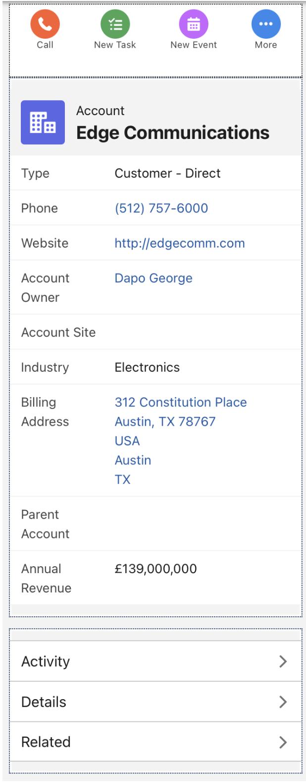
Activated for desktop and mobile, so field reps can log activity on the go.
Mobile view. The Header & Right Sidebar template collapses gracefully into a single, scannable column, proving the layout is genuinely responsive, not just desktop-first.
While this was a technical configuration, the core design philosophy was cognitive load reduction.
By separating Activities from Record Details, I cut the time-to-task for Account Managers, freeing them to focus on the customer relationship rather than navigating the CRM.
Upgrading a dense, hundred-field Account record into a modular, high-performance experience that surfaces only the most relevant data, on every device.
In large-scale enterprise environments, Account records often contain hundreds of fields. A static Record Detail page forces users to scroll endlessly to find what they need.
My objective was to upgrade a standard Account page to Dynamic Forms, creating a modular, high-performance experience that prioritizes only the most relevant data for the task at hand.
Hundreds of fields on one page bury the few that actually drive the work.
A rigid, monolithic layout means hunting top-to-bottom for a single value.
The same static page serves every persona, profile, and record state.
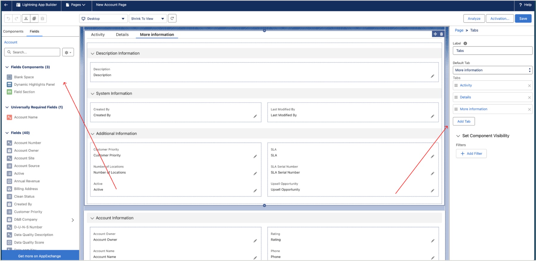
I transitioned the page from a rigid, monolithic layout to a flexible, component-based architecture built on Dynamic Forms.
Five curated “power fields” (Type, Industry, Phone, Rating, Owner) and four critical actions, so ~80% of tasks finish from the top 10% of the page.
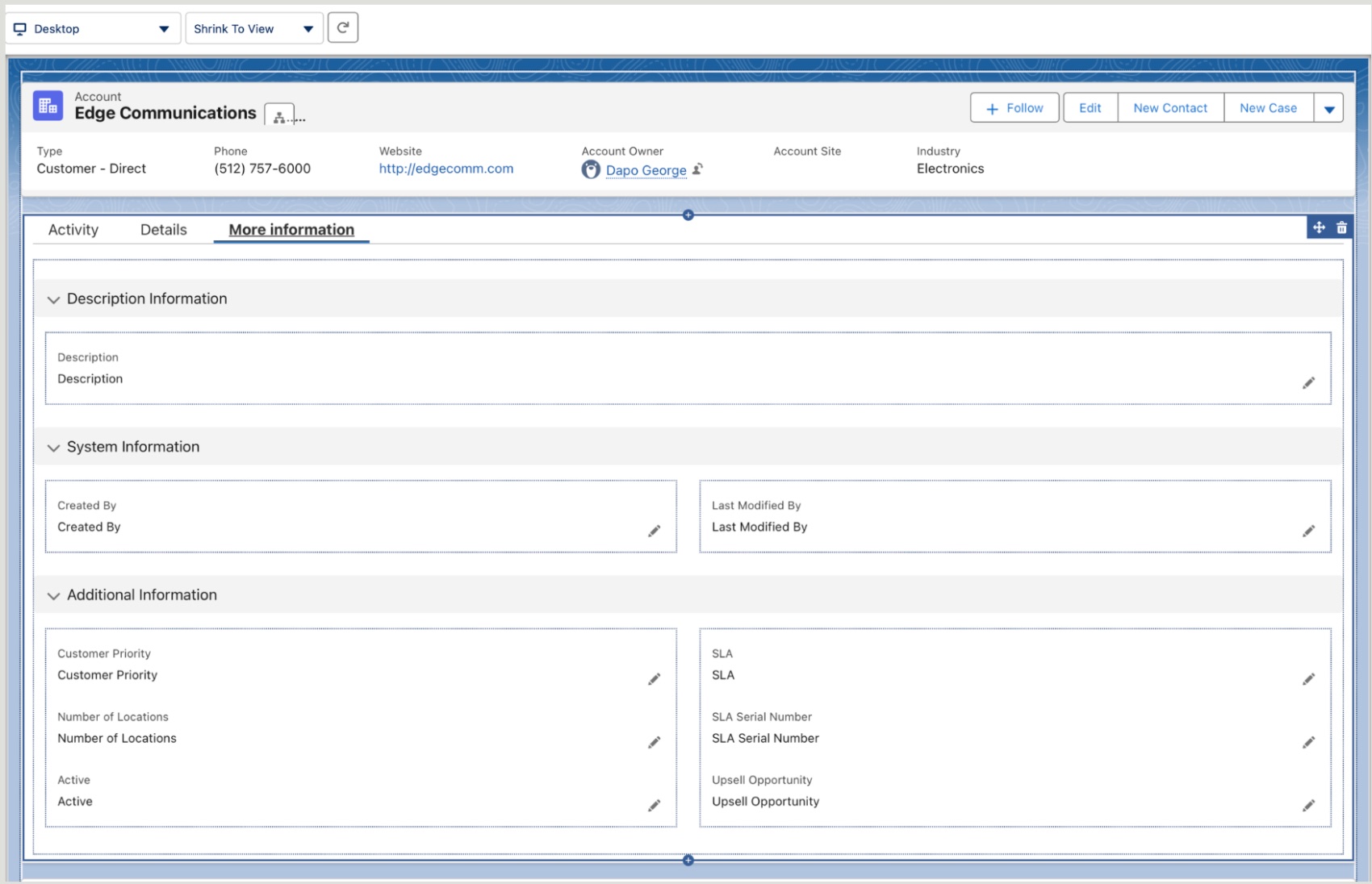
A “More Information” tab houses low-frequency System and Description data, cutting cognitive load while keeping it one click away.
A UI audit removed redundant or obsolete fields like Fax and SLA Expiration Date.
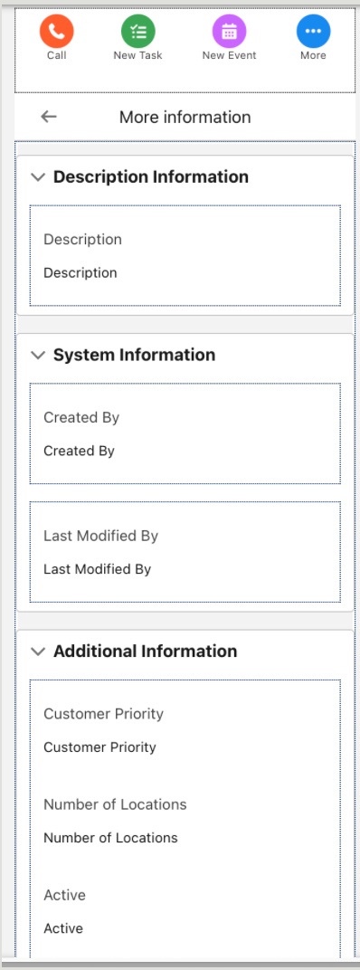
Dynamic Forms enabled on mobile too, one “single source of truth” that works in the office or in the field.
Mobile parity. The same Dynamic Forms layout renders natively on mobile, a unified “single source of truth” whether the user is at their desk or in the field.
By implementing Dynamic Forms, I moved beyond a “one-size-fits-all” layout toward an architecture built to scale.
As the business grows, visibility rules can show or hide fields based on user profile or record status, keeping the CRM clean, fast, and user-centric.